[ MARCH 11, 2024 ] - HOW I SPRITE
I felt like writing a page showing how I do spritework lol
SOFTWARE. I use a mix of Paint.NET and LibreSprite. I use Paint.NET to sketch/sprite, and LibreSprite to apply color palettes and break stuff into parts so I can then animate them more efficiently.
PALETTE. LibreSprite already gives me plenty of them. But you can make your own if you want.
CANVAS. I prefer spriting on a gray canvas; the size can be either 320x240 or 640x480.
Okay, now we have our blank gray canvas. I zoom in and out at 200/400/600/800%, always in the power of 2.

Let's decide the size of our sprite in relation to the screen! I think I'll draw Sonic. Sonic will be 32x48 in relation to 320x240. Let's turn the selected 32x48 area into a solid color; it can be any color. I prefer a strong color like red.
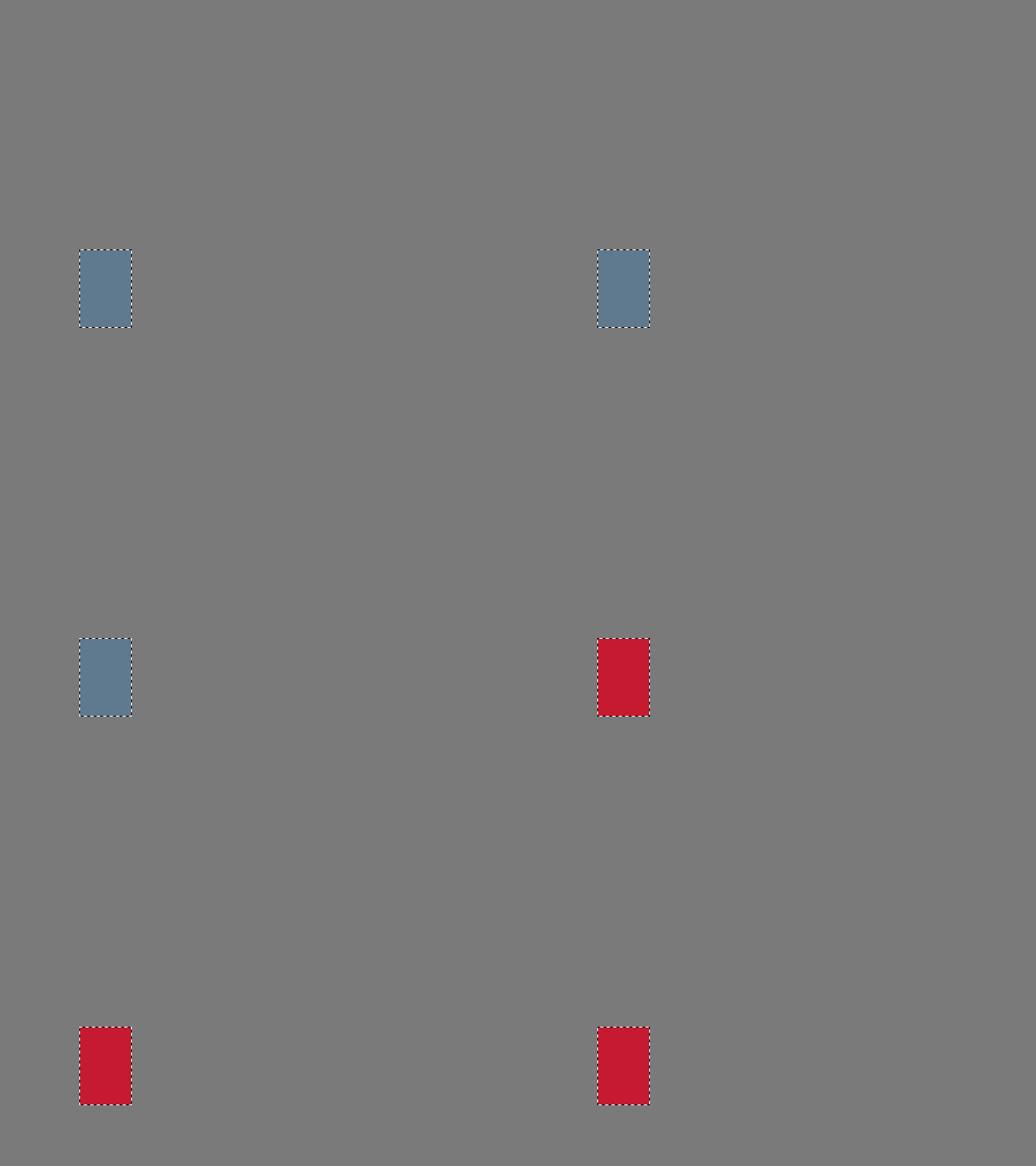
Still following the "by the power of 2" rule, I will now resize my canvas by 400%.

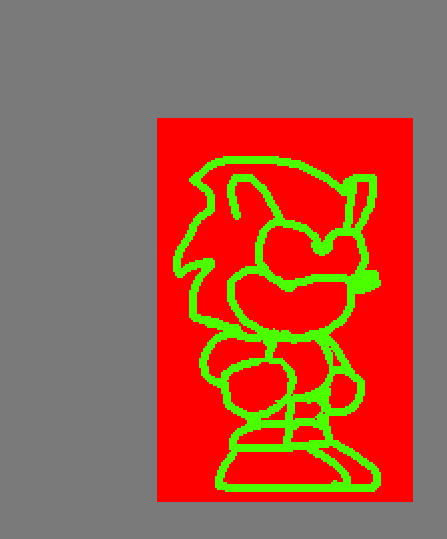
Now that my canvas has been expanded, I can doodle a little Sonic within the red square I just made. About brush size? There's a small rule I made. If I resize the canvas by 400%, then the brush should be 4px. If I resize it by 600%, 6px. 
Don't worry about accuracy for now, I'm doodling the "general idea" of what the sprite should look like at this point, so no details as of now. Here's how it looks.
Now, I shrink it BACK to 320x240, which is the canvas size I initially made the red square on. Look at that! Now you have a little Sonic. He's kinda fucked up though, but you can definitely see it's Sonic. I will now flatten all layers, paint the red square the same color as the background canvas, and give it a black outline.
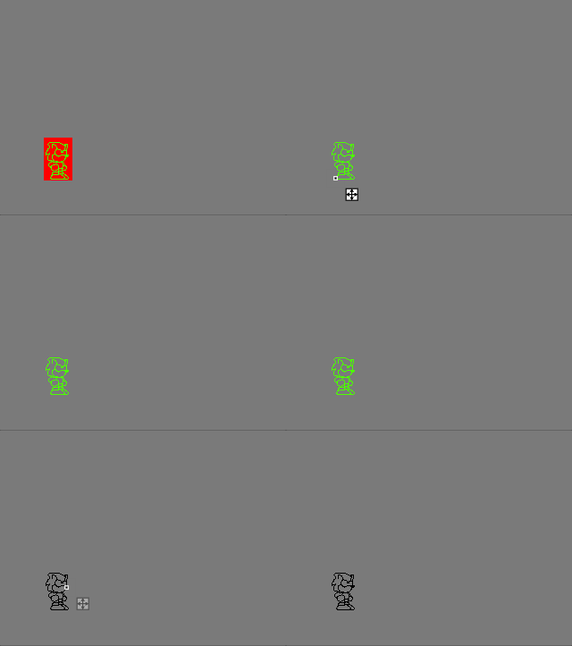
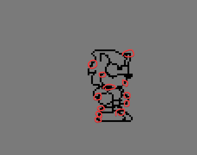
The outline and details are broken, there shouldn't be any jaggy lines! Here's all the jaggy lines in the image down below. I then decided to give him a basic color palette of just 3 extra colors.
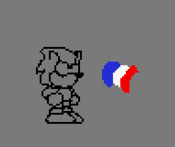
Now here's how he looks after a few touch-ups.

Sometimes, I like to apply a 2px outline in case we're dealing with large resolutions, like those up to 720p. It makes them stand out when they're in motion in something like a game or animation. When the outline is 1px in large resolutions, you might not be able to focus on it properly. That's optional since it heavily relies on the art style of whatever you're doing at the moment. Milirats uses a 2px outline for characters, for example. The reason is because the game's window is 1280x720, so having them be 1px just doesn't work that well. If it were something like 960x540, then 1px would still work.

When it comes to shading, I just put a few pixels here and there with a more dark "blu-ish" or "reddish" tone. It looks good enough for me. Just try to not go too overboard; otherwise, you might do the ultimate sin... PILLOW SHADING.
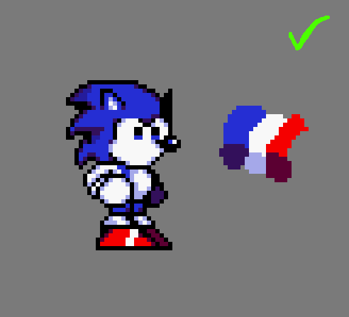

That's pretty much it...
THEND
